

CalFresh EBT Outreach Campaign
Visual Identity | Print

Project Information
The Campaign Identity
THe Deliverables
The Design in Action
HealthyU, an on-campus grocery store in San Francisco State University, implemented CalFresh and EBT, food assistance program helping low income idnividuals. This was an important thing to inform students who were financially low on funds. So they wanted to make people aware.
To put on a successful they did outreach in store through implementing physical deliverables, mostly signage. Campaign needed an identity (while adhering to existing guidelines). I was briefed to create flyers, banners, razor flags, stickers.
Project Information
The Campaign Identity
The Deliverables
Final Product
The Campaign Identity
Campaign Logo
The client requested some sort of grocery store motif for the logo, so I created a grocery bag. This campaign didn’t have a name, so no logo lockup was needed.

Sponsor & Partner Logos
A few programs were involved in this program. Their logos needed to be included on the flyers.


Color and Type
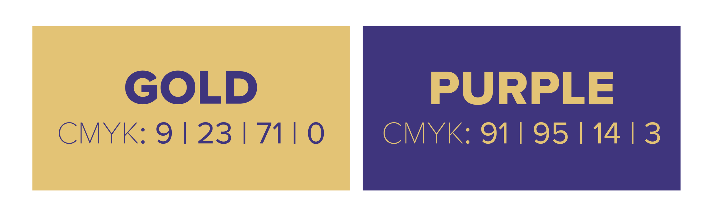
While this campaign had its own logo, it did not have a separate color palette. I used SFSU’s signature gold and purple tones.
For type, I chose Proxima Nova for its sleek but round and friendly vibe.

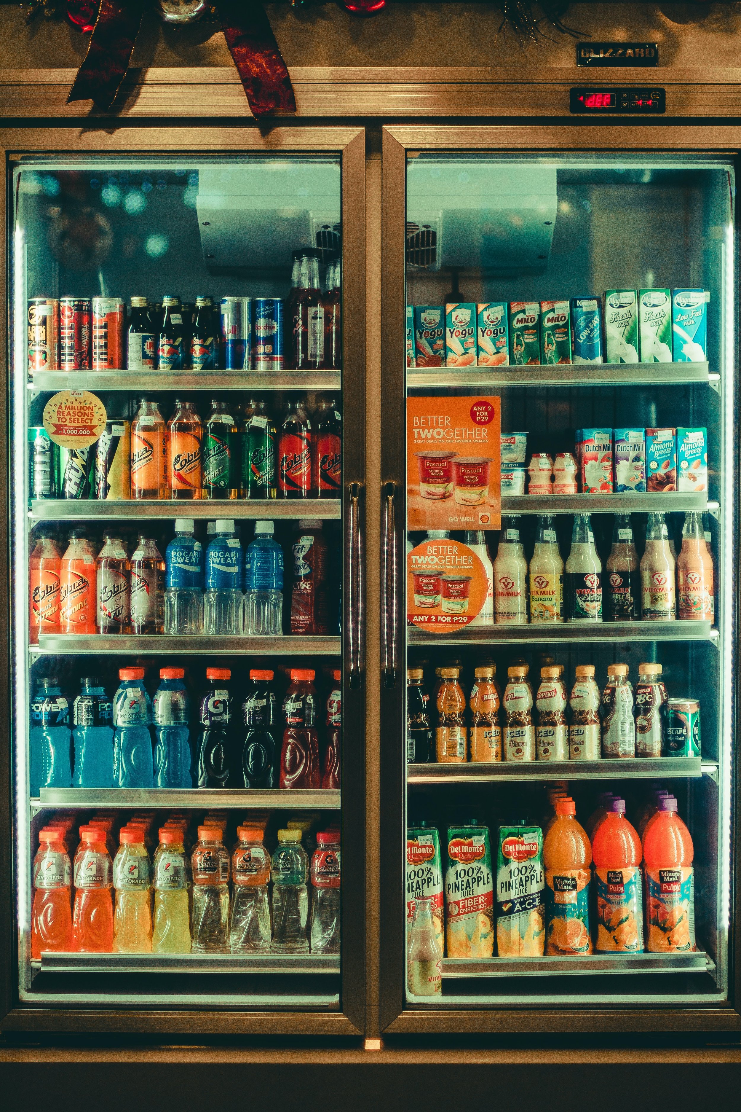
Imagery
The client requested to include photography in some way. I scoured Pexels for image options and selected three final images.


The Deliverables


Project Information
The Deliverables
The Campaign Identity
The Design in Action

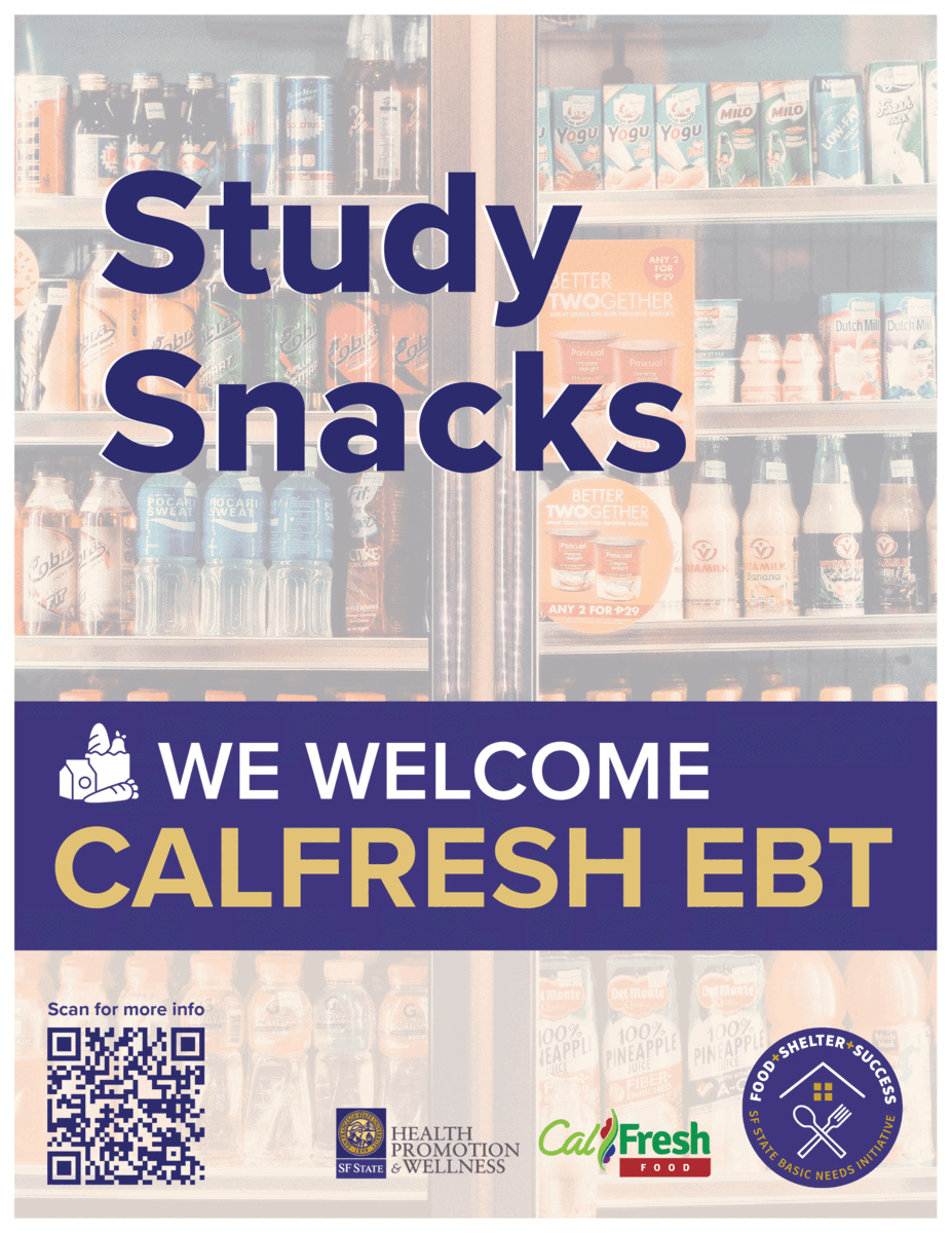
CTA (Call to Action) Flyers


Using the client’s copywriting, I created a set of 5 CTA flyers.
Each flyer required a few dimension variations to fit different use cases. Shown here is a standard 11x17.
Headline Flyers

These were flyers with just a headline.
Just like with the CTA set, I created a few different sizes. Shown here is an 8.5x11 variation.
Sign


The sign’s purpose was to be placed near the cash register.
Banner


Banners would be used as marketing outside the store and around campus.
Razor Flag


These were another fun option for marketing and outreach purposes!

Project Information
The Deliverables
The Campaign Identity
The Design in Action
The Design in Action

When the campaign first launched, I visited the store in person and got to see the final products set up! It was so cool to see everything set up in person. Below are some photos of a few of the deliverables.

