

O2 VALLEY REBRAND
Branding
Project Information
The Logo
Final Deliverables
Brand Identity
As more and more boba shops are popping up in the Bay Area, brands need to rethink what makes them stand out in order to keep up with the competition.
O2 Valley can leverage their extensive food options to help them stand out amongst their competitors. The goal was to lean more into that specialty in an elevated visual identity, but still keep their core brand identity and how they market themselves in the competitive landscape.

Project Information
The Design Process
Brand Research
Final Rebrand
Brand Research
Who are the competitors? I searched Yelp and found a few restaurants located in the same area. I conducted research on three: Chick & Tea, Orange Square, and Shihlin Taiwan Street Snacks. I checked out their websites and read reviews for them and gathered my intel. All three are pretty similar to O2 Valley with price range and food and drink options.

I then pivoted to researching my client. Not only did I take part in the typical online research, but I also conducted observational research by visiting the actual location. I talked to the employees and the customers, and even tried their food and drink!
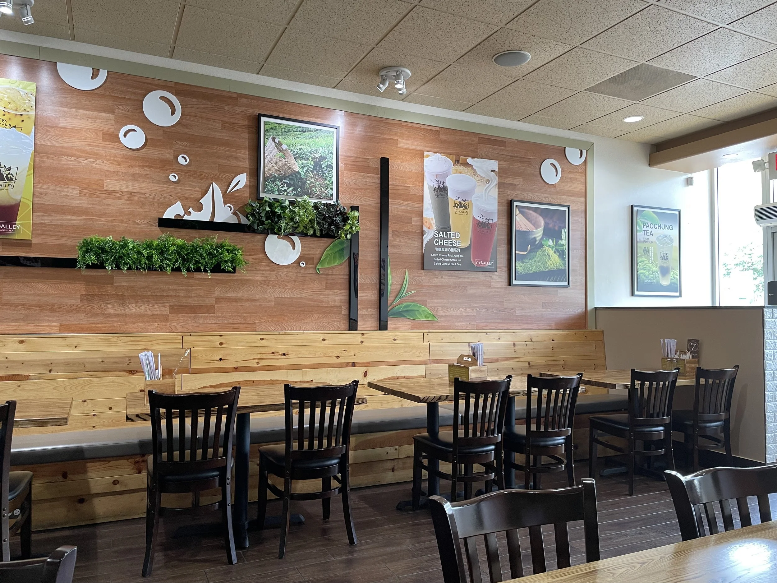
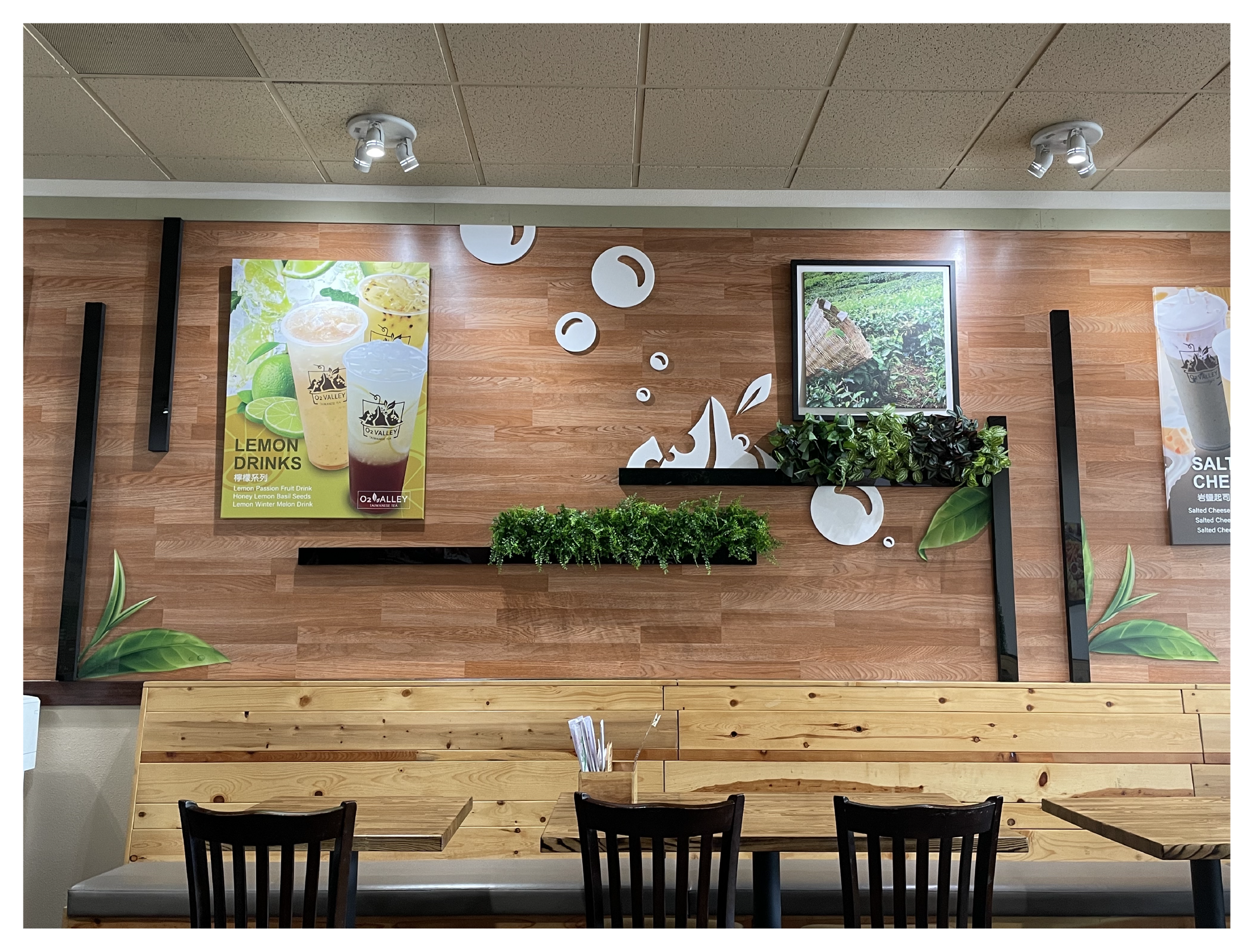
O2 Valley definitely possesses some unique characteristics that help them stand out. For example, the portion sizes of their meals are huge and they provide warm and intimate customer service. Most importantly, their current brand identity gives off a zen and peace vibe is very unique, as these ideas are not typically associated with boba shops.
Another important discovery was that O2 Valley is more known for their fried chicken rather than their boba.


Project Information
Design Process
Brand Research
Final Rebrand
The Design Process
I gathered inspiration images that fit their current brand identity and values, images that convey a sense of nature, balance, zen, and peace.
Moodboard


Logo
O2 Valley’s original logo was a combination of a boba drink and a valley. While creative, I felt there was too much going on for the function of a logo. For the new logo, I aimed to convey the same natural feel in a simplified look while also incorporating their expertise in chicken dishes rather than boba.
I went through three rounds of iterations. Round one involved free-hand sketches, round two was was iterating on the top three directions. and round three was where I further explored one final concept,.

Round 1

Round 2

Round 3


Project Information
Design Process
Brand Research
Final Rebrand
Final Rebrand
The final logo includes two chickens “hugging”, creating a friendly and warm feel. The two chickens also come together to form a yin and yang sign. Calm blue and green tones convey a natural feeling, referencing water and vegetation. The cursive and connected nature of the restaurant name mirrors the chickens and completes the logo.


These are the logo variations. The original logo’s vertical orientation helps it fit tighter, more proportional spaces, while the horizontal version allows for applications like a website header. The logo can also be split into its icon and logotype.
Upgrade is the brand typeface. This typeface is easy to read with a clean and uncluttered feel.
The brand color palette consists of light and dark versions of orange, blue, and green. The tones look natural and and calm. A dark brown and light yellow provide more contrast when needed, rounding out the palette.


The leaves scattered throughout this page are the brand’s graphic elements. It has great usability: it can be adopted as an icon and it can also be used to create a pattern, more clearly shown in the below mockups!

