
TAZO TEA PRODUCT LAUNCH
Visual Identity | Packaging

Project Information
The Logo
Final Deliverables
Brand Identity
With a new line of products, Tazo Tea wanted a fresh spin on their current packaging design while still keeping core elements of their brand, calling for new interpretations of how to be bold and dynamic. How could I take bold in a different direction?
Tazo Tea is all about being unique. They explore unexpected and unique combinations of flavors in their tea blends and stray away from classic or “safe” flavors. They are also more than just a standard tea company, taking stands in social issues such as climate justice and racism. The TAZO brand is not tea: it is action, excitement, and ____.

Final Product
Brand Research
Design Process
Project Information
Brand Research
After researching extensively on all things Tazo, I learned that this tea brand is all about being proactive and exciting. They show this through not only their bright and colorful visual identity (the vibrant splashes of color and photography) and unique flavor combinations, but also through their actions. For example, they are active in real world topics such as social justice and sustainability.
I put together a brand communication audit to clearly lay out their identity and values,as well as their strengths, weaknesses, opportunities, and threats.

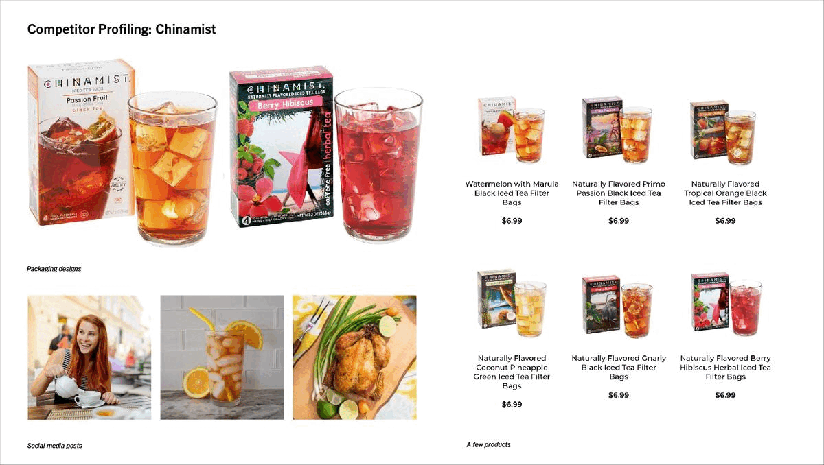
Additionally, I looked at two competitor brands to gauge Tazo’s positioning in the tea industry.
Good Earth Tea

Chinamist
Project Information
Design Process
Brand Research
Final Product
Design Process
The first step in the design process was to propose two potential art directions for the new visual identity, that are distinct from each other but still follow the brand values and style.
Direction 1: Dimensional
Gradients, textures, and shapes layer together to create a dynamic look and feel.

Direction 2: Retro
Bright colors and distinct patterns join together for an exciting old-school vibe.


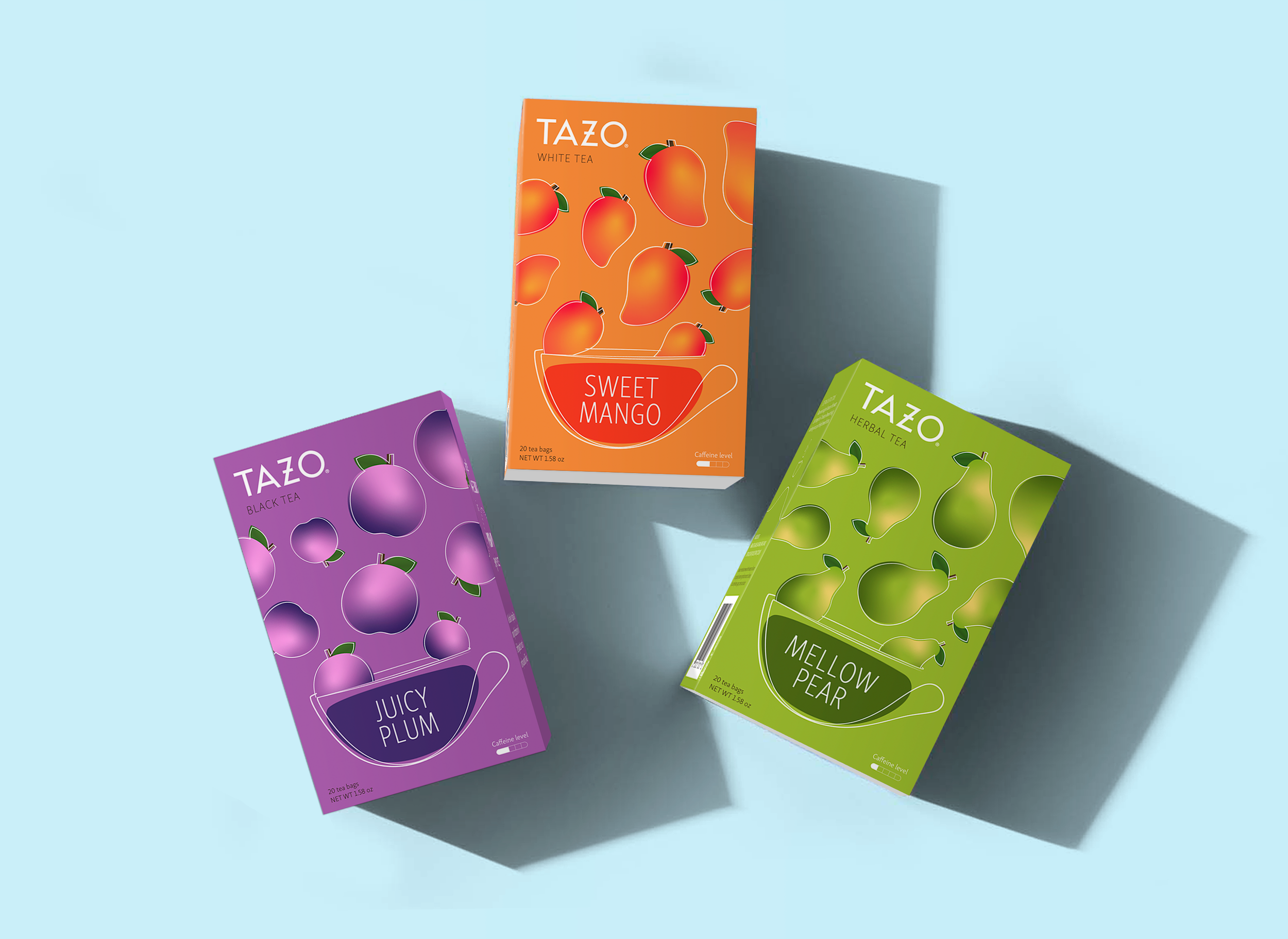
Ultimately, Direction 1 made more sense for the Tazo identity. I breathed life into this concept by exploring elements to its graphics and visual style. This background shows the final art direction, which involves a playful layering of smooth color gradients. Stark white lineart contrasts the color brilliantly.
With the direction solidified, I moved to iterations.


This layout stood out the most. While I worked solely with one flavor at the beginning of my design process, I began to work on all three. I refined, refined and refined!


Project Information
Design Process
Brand Research
Final Product
Final Product
The final design differs from the old packaging, but still feels like the Tazo brand. There is a clear emphasis on the tea flavor as the ingredients are the only element that has a gradient treatment; the teacup, liquid, and background were designed in either a solid color or lineart.


Each panel of the package also interacts with each other! A wispy line flows through the design, and the fruit graphics on the front panel bleed to the adjacent. The package feels like one, less so if the panels existed individually as separate entities.