

DIET CULTURE CAMPAIGN
Visual Identity | Print | Digital | Motion Graphics

Project Information
Final Design
Design Process
Diet culture is the idea that being thin is the ultimate goal and that body fat is unattractive. With today’s rise of the internet and social media, diet culture—and how related ideas impact eating disorders—are more relevant than ever before.
Diet culture is an incredibly complex subject with many different layers of discourse. Because of that, discussions usually involve a bird’s eye view of the entire concept. It’s not very common to dissect and talk about diet culture in its separate parts. I decided to focus on its relation with social media and eating disorders, with the ultimate purpose of my design solution to raise awareness and create more conversation about the intersection of these three ideas.
Project Information
Final Design
Design Process
As I began thinking about the final product, I decided that I wanted to create large, eye-catching signage of some sort. This visually-interesting signage would be used as live activations, placed in public areas to engage passerby who would then be able to visit the campaign website where they can access more information and resources.
Research

Research included examining scientific studies, peer reviewed journals, and trusted hubs of information such as the National Eating Disorder Association.

Miro was a great tool to organize research and design work.
Inspiration, Ideation, Iteration
There was a lot of different parts to this project, with elements living in both live and digital. The campaign needed its own visual identity as well.


I tackled the signage first. I gathered images on Pinterest for inspiration and engaged in an initial iterative process where I quickly laid out visualizations that came to mind.
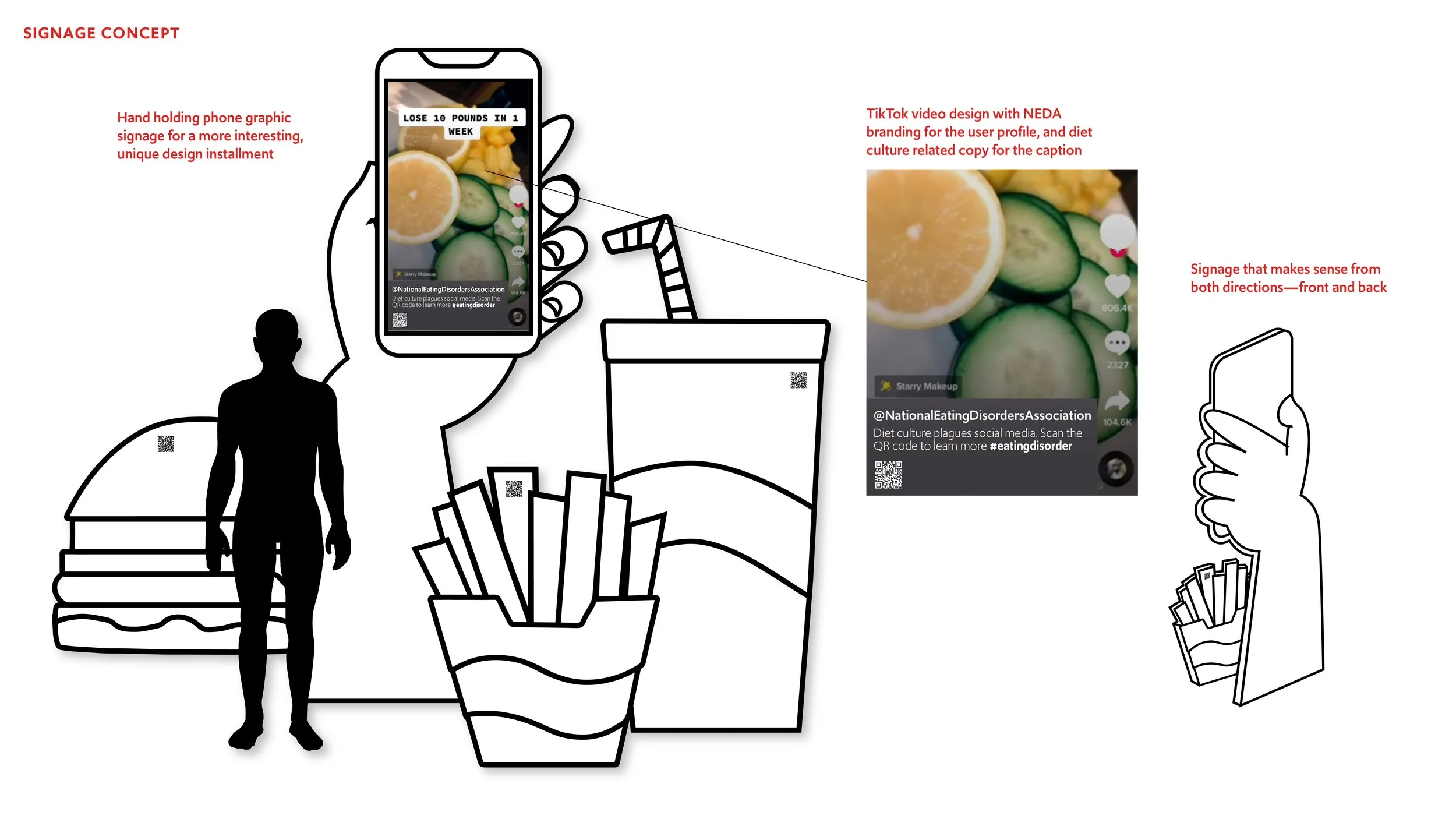
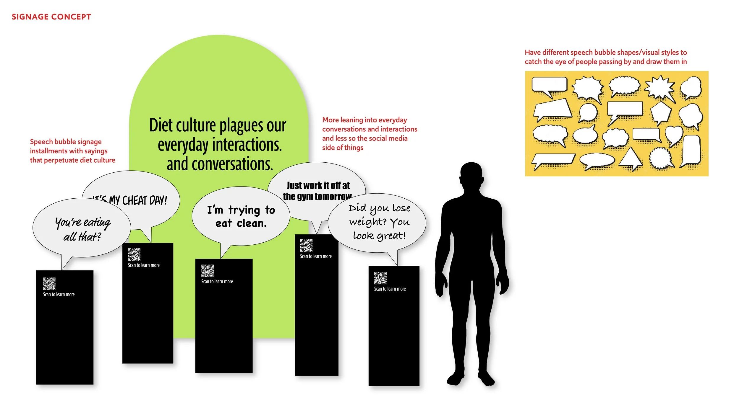

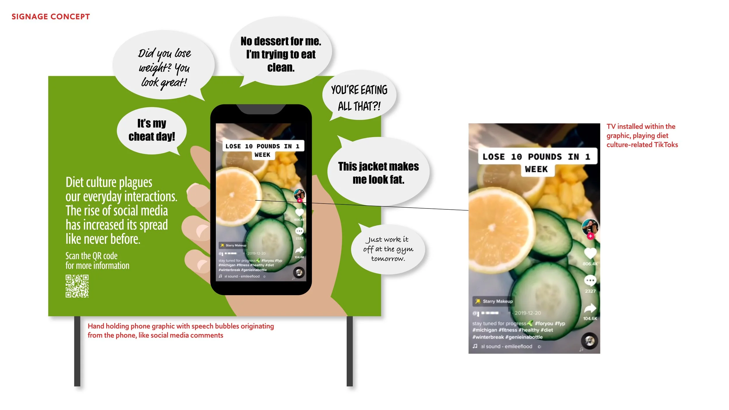
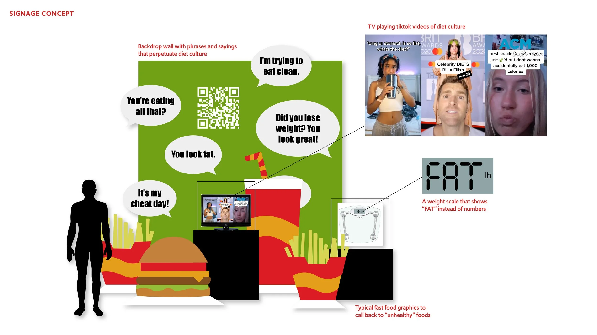

I solidified a concept involving hands holding phones and worked on further iterations, exploring how the individual pieces could work together in a designed space. I also looked at ways to display text and other visuals, including where to place the logo, another component I began working on.


Part of what makes the signage visually engaging is that it will involve beautiful motion graphics, so I iterated on a few concepts by laying out storyboards.


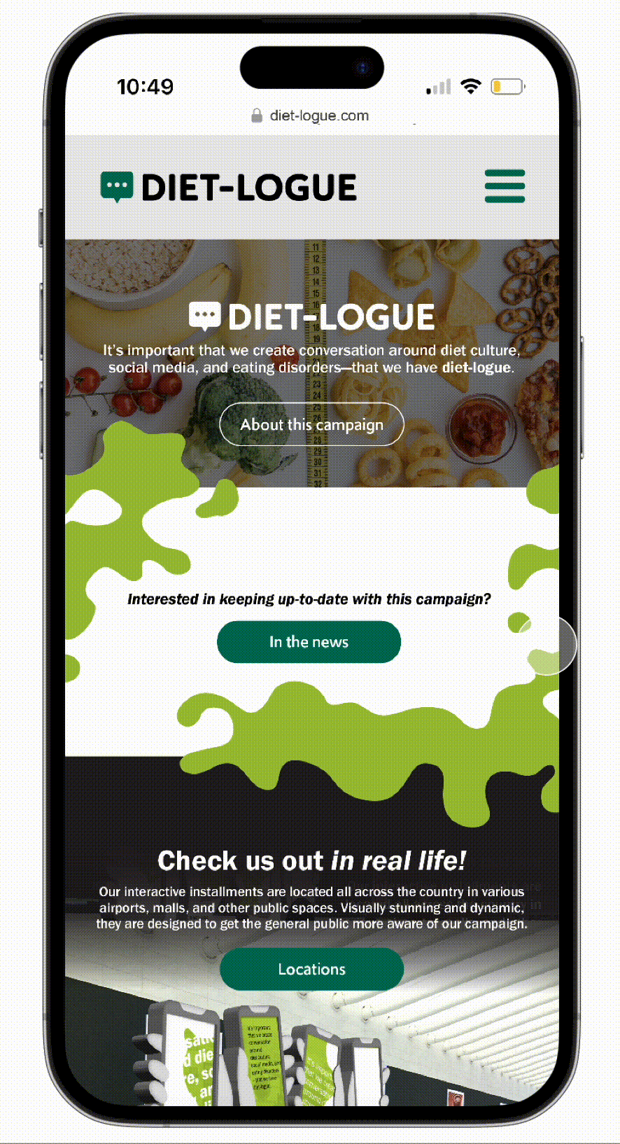
“Diet-logue” is the final product—a campaign dedicated to spreading awareness and creating more open conversation around the topics of diet culture, social media, and eating disorders.
Dynamic signage activations are placed in public areas around the country to catch the attention of passerby. These activations are linked to a website where that houses information, education, and resources.


Project Information
Final Design
Design Process
Visual Identity
The logo is a simple speech-bubble placed next to the name of the campaign. The dark green color of the icon is one of two main shades in the color palette, the other being a light green with a yellow tint. This color resembles disease, referring to the “spread” of diet culture ideas.
The typeface FranklinGothic URW fits this campaign perfectly, not only in aesthetic but also usability: it’s easy to read when blown up to large sizes as well as when it’s reduced to use for copy.

Captivating Signage
To create visual interest, the signage takes the forms of hands and arms and implements unique angles and curves; the visuals of the static signage work together with dynamic motion graphics, all in all creating a stimulating experience.
As viewers approach the signage, they would be able to read the text; this is when they would be able to visit the campaign website and/or access Diet-logue’s augmented reality space.

Additionally, the design is crafted in a way that allows the signage to be accessible from both sides.


Dynamic Motion Graphics and an AR Environment
The motion graphic sequence involves a wondrous looping sequence of exploding and shrinking color to highlight textual elements. The color that spreads to all four phones symbolizes the influence of diet culture, affecting all those who are online and consuming those ideas.

This video shows the motion graphic as well as the AR space in action.

Take a closer look at the transition from live to AR!


Essentially, if the motion graphic is viewed in real life, the text displays a general call-to-action. However, if viewed through a phone camera, the text contains content that is potentially triggering to select audiences.
The addition of AR technology effectively solves the issue with triggering content.
A Website to Centralize Information
One of Diet-logue’s goals is to provide clear and accessible information, so a prominent section of the campaign website is its education space. Here, Diet-logue translates complex ideas into simple terms, so that anyone can understand it.


The campaign has a page on the NEDA (National Eating Disorder Association) website, providing another access point.
