Spreading awareness
Designing for a campaign for sexual assault awareness month
The month of April
SAAM is a campaign with the goal of spreading information and resources about sexual assault. Their mission is to promote safety, inspire action, and show support to survivors. The campaign takes place every April.
My college participates in this campaign and hosts different events throughout the month about the topic. I was asked to design a booklet as well as Instagram story posts to promote these events as well as various resources that the student body at my college can utilize if needed.
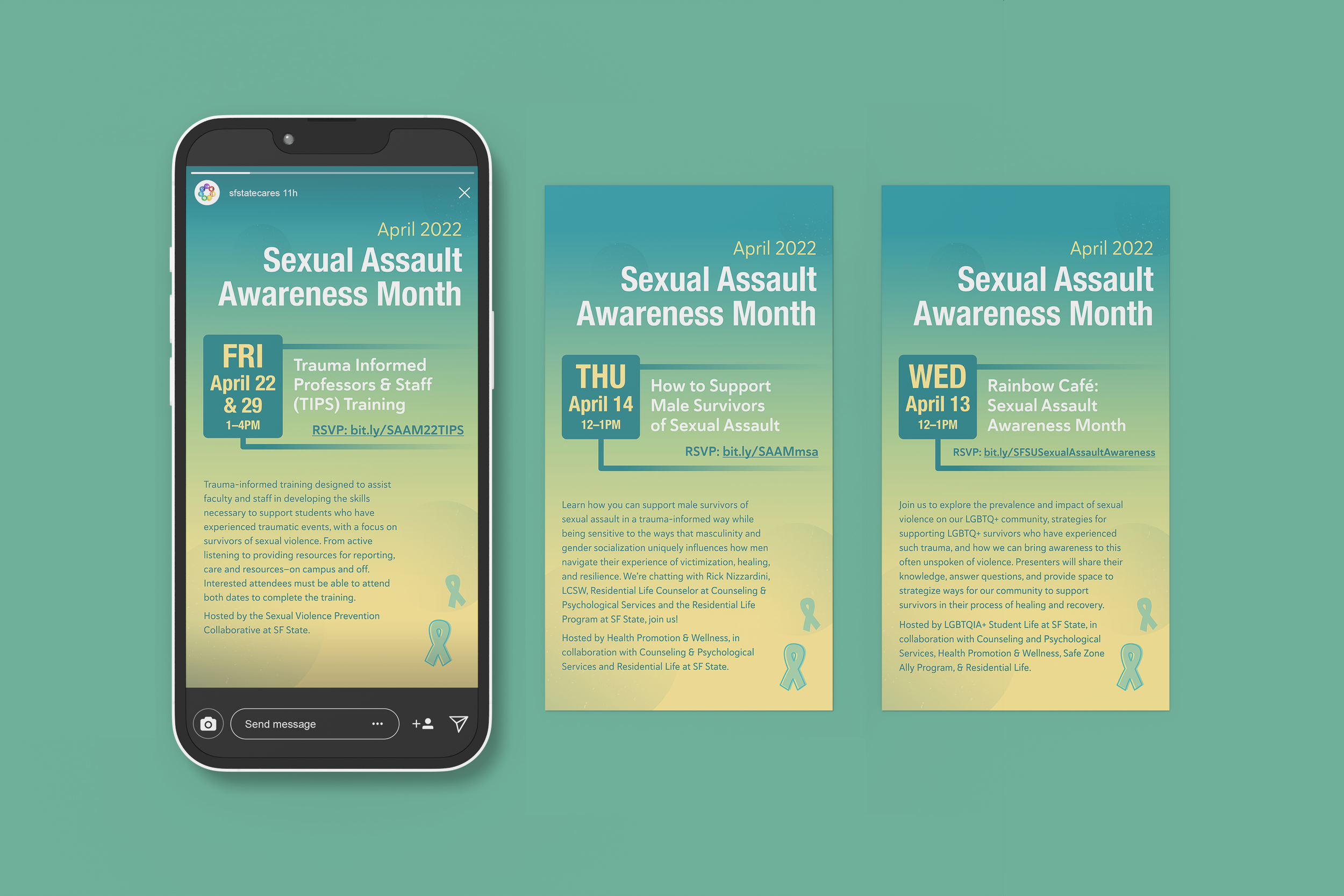
The design
2022’s campaign focused on promoting safe spaces in online communities. With that in mind, I wanted to create a design related to social technology. I ended up with a hand and phone graphic as the dominant feature of the booklet cover.
Since teal is the main color of SAAM, I settled on yellow as a secondary color that wold provide good contrast but also mesh well with the blue-green hue. And, here and there throughout the booklet, I made sure to add the ribbon symbol of this campaign.Finally, I added translucent spotted circles to add more interest to the solid teal backgrounds.


Final thoughts
I really admire SAAM’s mission and enjoyed designing for this initiative! One crucial element to this design process was looking at the longest piece of type and figuring out layouts and spacing based on that.